If you’ve been told that simply choosing light colors will automatically make your small living room feel more expansive, it’s time for a reality check. While the right paint color can help, it’s not a miracle fix. In fact, picking the wrong shades or finishes can actually make your space feel even more cramped. Let’s break down the common paint color mistakes people make when trying to make a small living room feel bigger, and how to avoid them.
Overly Saturated Colors Can Make Spaces Look Smaller
Bold, dark, or highly saturated colors absorb light rather than reflect it, which can make walls feel closer and ceilings seem lower. Colors like deep reds, intense blues, or vibrant purples might add personality, but in a compact room, they often draw the walls inward and emphasize the room’s physical boundaries. Unless your small living room has abundant natural light or you use these tones strategically with balance and lighter accents, they risk reinforcing the cramped sensation. Instead, prioritize shades that enhance brightness and reduce contrast between surfaces, which helps the room appear more spacious.
Light, subtle colors have a psychological effect that makes walls visually recede. Soft neutrals, pastels, and gentle hues bounce light around the space rather than trapping it. Look for whites that lean warm rather than stark, soft greys, pale blues, and muted greens to make walls feel more distant. These tones diffuse light more evenly, softening shadows and decreasing the obvious edges that make a room feel confined.
Rather than creating stark lines between walls, trim, and ceiling, choose tones that are close in value across all surfaces. This continuity allows the eye to move freely without interruption, making the space read as a single, uninterrupted volume.
Avoid Extreme Contrast Between Walls and Trim
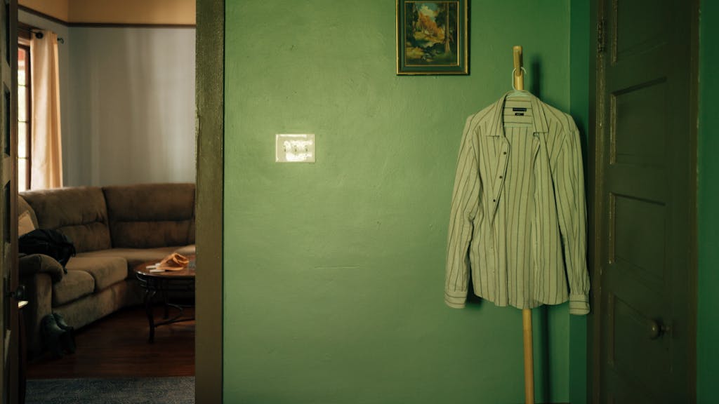
High contrast between walls and trim, such as bright white walls paired with dark baseboards or trim, can draw attention to the edges of the room and make the space feel smaller. This visual division limits the perception of space and sharpens the room’s corners. To make your room feel larger, opt for subtle transitions between the wall color and the trim. Stick to colors that are within the same tonal range to create a more seamless flow, allowing the eye to travel more freely around the room without interruption. This minimizes sharp edges and creates a more open and connected feel.
Choose Light Reflective Colors That Don’t Overpower the Room
The simplest way to make a small room feel bigger is to use paint colors that reflect as much natural and artificial light as possible. Light tones like off‑whites, soft beiges, and pale blues create an airy feel because they bounce light instead of absorbing it. A carefully chosen off‑white with a slight warm undertone gives the walls a luminous glow, making shadows softer and diminishing the stark definition of corners. These hues work especially well in rooms with limited windows because they maximize whatever light is available.
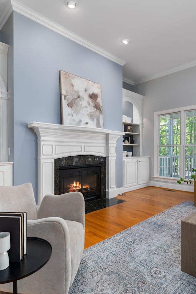
Neutral shades with subtle undertones keep the space from feeling washed out. A pale greige, which sits between beige and grey, offers warmth and dimension while maintaining brightness. Gentle blues or cool greys can also enhance the perception of space because their cool undertones mimic open skies or water, which the brain naturally associates with expansiveness. Paired with similarly pale trim and ceiling, these tones create visual continuity that diminishes vertical and horizontal boundaries.
Avoid pairing a very light wall color with stark white trim or a stark white ceiling. High contrast outlines the edges of the room, making the dimensions feel sharper and more confined. Instead, use colors that are close in tone so the transition from wall to trim feels seamless and understated.
What You Might Be Doing Wrong With White Paint
Painting every surface pure, bright white is conventional advice for small spaces, but straight white isn’t always the best choice. Bright white with cool or blue undertones can create harsh contrasts with shadows in a compact room, paradoxically emphasizing corners and making the space feel smaller. Moreover, under artificial lighting, an icy white can feel sterile or glaring, working against the goal of openness.
A more effective approach is to select off‑white or creamier whites with gentle warmth. These diffused tones soften shadows and provide a more continuous reflection of light. They also pair better with furnishings, textiles, and warm lighting, creating a more comforting and expansive atmosphere rather than a clinical one.
Another strategy is to use a slightly lighter paint on the ceiling than on the walls. This helps draw the eye upward and visually raise the room’s height. When the ceiling color is barely distinguishable from the walls, it reduces the visual break that makes ceilings feel lower.
When Dark Colors Work and When They Don’t
Contrary to popular myths, dark colors are not always the enemy of small spaces. In rooms with ample natural light or balanced artificial lighting, deeper tones can add depth and richness without shrinking the space. When used as accent walls or on one surface with lighter complementary colors around it, a dark hue can create a sense of depth that visually pushes the wall back. However, using dark colors on all walls without this contrast typically makes small rooms feel denser rather than larger.
Deep shades like green‑inspired hues or muted charcoal greys can lend sophistication while still maintaining expansiveness when carefully balanced with lighter tones on furniture, décor, and floors. The key is strategic placement and moderation, not an all‑over dark paint that absorbs light and defines boundaries too sharply.
Integrate Color Choices With Lighting and Layout
Paint alone does not change square footage. The illusion of space comes from how the room’s elements interact. Natural light reflects off lighter walls, unifying the ceiling, trim, and floors. Poor lighting or mismatched contrasts can diminish the impact of any paint color, no matter how carefully selected. Incorporate multiple light sources such as floor lamps, wall sconces, and table lamps to enhance brightness and reduce harsh shadows.
Furniture and layout also influence how colors perform. Bulky furniture against a pale backdrop can still make a room feel cluttered. Keep furnishings appropriately scaled to the space and maintain clear walkways so the paint’s effect on openness is not counteracted by visual or physical clutter.
Conclusion
Choosing the best paint colors to visually enlarge a small living room is not as simple as grabbing the lightest can off the shelf. It requires balance, attention to undertones, lighting, and how colors interact with the room’s surfaces and furnishings. By selecting light-reflective colors with subtle undertones, avoiding high-contrast outlines, and integrating paint choices with thoughtful lighting and layout, you can transform a cramped room into a visually open and inviting space. How you apply color and light together is what truly makes a small living room feel bigger and more comfortabl