The colors we choose for our homes quietly dictate how we experience each space, shaping moods, energy levels, and emotional well-being without us even realizing it. Selecting a shade is rarely just an aesthetic decision; it determines whether a room feels cozy, stimulating, peaceful, or tense. When a color dominates a space without careful consideration of lighting, purpose, and contrast, it can subtly erode comfort and make a home feel emotionally heavy or disorienting over time. Every wall, piece of furniture, and accent can amplify the psychological impact of color, which is why understanding how colors interact with mood is essential to creating a home that genuinely feels like a sanctuary.
Red
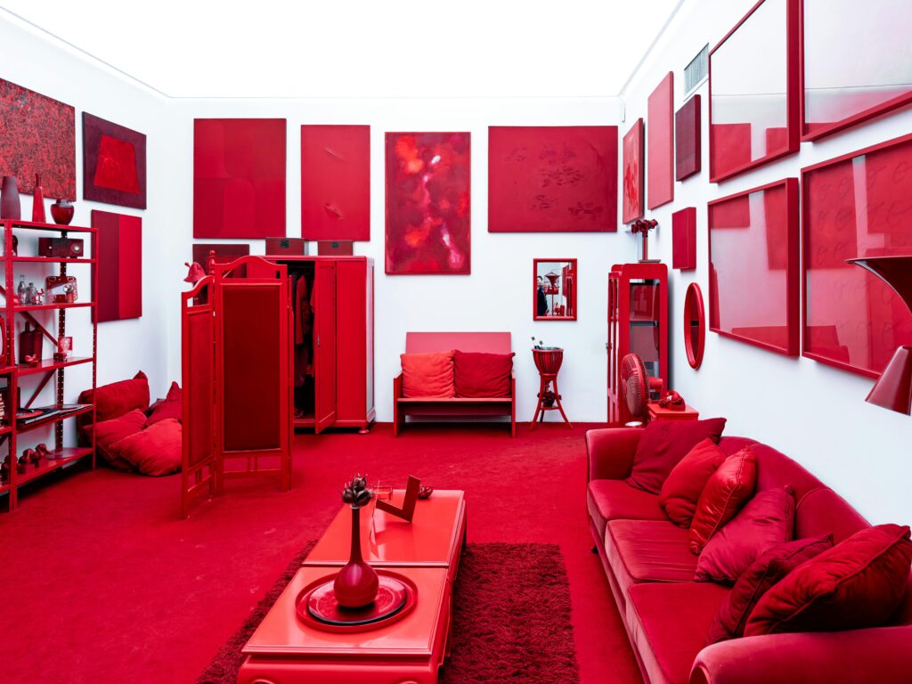
Red is the most vivid and emotionally charged color in the palette, radiating warmth, energy, and intensity. In social areas like dining rooms or living spaces, red can add vibrancy, encouraging conversation, interaction, and engagement. It gives a room a cozy, intimate vibe and can even stimulate appetite or excitement. However, red is rarely suitable for bedrooms, bathrooms, or quiet nooks, where the goal is rest, reflection, or relaxation.
When applied across large walls or combined with other high-intensity elements, red can make a room feel overstimulated, tense, and emotionally charged, leaving occupants on edge rather than comfortable. Balancing red with neutral accents, soft textiles, or smaller pops of color helps harness its energy without letting it dominate the space entirely.
Yellow
Yellow naturally conveys sunlight, joy, and positivity, making it a popular choice for kitchens, breakfast nooks, or areas where a sense of natural energy is desired. It can lift spirits and make even the smallest or dimmest spaces feel cheerful and open. But the problem arises when yellow is too bright or overly saturated, creating a visual intensity that can overwhelm the senses.
Neon, lemon, or high-chroma yellows can feel aggressive, causing fatigue, agitation, or even stress over prolonged exposure. To preserve comfort, yellow works best in soft, muted tones such as butter, ochre, or warm cream, and is paired with complementary textures, natural wood finishes, or calming neutrals to prevent overstimulation. The goal is to maintain an uplifting, energizing presence without making the room feel emotionally exhausting.
Gray
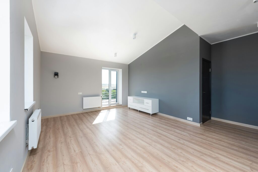
Gray has earned its reputation as a sophisticated, modern, and versatile color that pairs easily with almost any palette. It provides a neutral backdrop for artwork, furniture, and decorative accents while evoking a sense of calm and understated elegance. Yet gray can make a room feel cold, flat, or emotionally detached when overused.
Large expanses of gray, combined with minimal texture and insufficient warmth, can create environments that feel sterile or uninviting, particularly in spaces with limited natural light. To ensure comfort, gray should be layered with warm tones such as natural wood, soft creams, terracotta, or subtle metallics. Adding tactile elements like woven fabrics, rugs, and textured upholstery also helps gray spaces feel grounded and welcoming rather than distant or austere.
Black
Black is a dramatic, sophisticated, and grounding color when applied strategically, providing depth, definition, and elegance to a home. It can highlight architectural features, frame artwork, or provide a striking contrast against lighter elements. However, black can quickly become oppressive when it dominates walls, floors, or large furniture pieces without relief.
A room filled with too much black can feel heavy, closed-in, and emotionally restrictive, detracting from comfort and serenity. The key is to use black as an accent, allowing it to structure a space and highlight details rather than serve as the primary atmosphere. Combining black with lighter colors, natural textures, or soft lighting preserves its sophistication while preventing the space from feeling overwhelmingly dark or cold.
Blue
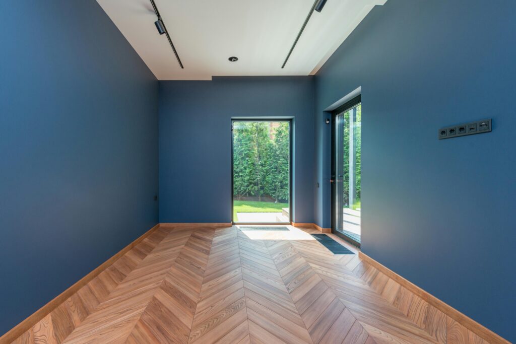
Blue has long been associated with calm, tranquility, and restorative environments, making it ideal for bedrooms, bathrooms, and areas designed for reflection or relaxation. Muted blues, dusty navy, or blue-gray tones create a sense of serenity, helping reduce stress and supporting restful experiences. However, the wrong shades of icy, highly saturated, or overly cool blues can produce a chilling or distant effect, making rooms feel uninviting, emotionally cold, or stark.
The psychological impact of blue depends heavily on lighting, undertone, and placement; a north-facing room may exaggerate coolness, while a sunlit room can soften the same shade beautifully. Pairing blue with warmer materials, such as wood, textiles, or cream accents, creates a balanced atmosphere that preserves calm without causing discomfort or emotional detachment.
Green
Green embodies harmony, balance, and connection to nature, offering a soothing, restorative presence in living rooms, offices, kitchens, and bedrooms. Sage, olive, and muted forest greens create an environment of groundedness, fostering comfort and emotional stability. However, muddy greens or overly yellow-leaning greens can dull the room’s energy and create a heavy, fatigued atmosphere.
The key is to integrate green in ways that feel natural and balanced, complemented by soft neutrals, warm textures, and tactile materials. When combined with natural wood, cream tones, terracotta, or subtle metallics, green maintains its soothing quality while avoiding dullness or lifelessness, keeping spaces fresh, vibrant, and psychologically restorative.
Orange and Purple
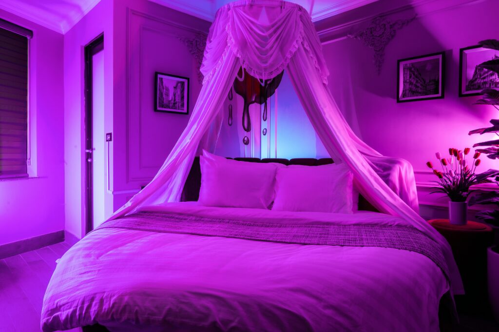
Orange and purple bring energy, creativity, and sophistication into a home, but both can overwhelm when used in excess. Orange encourages movement, sociability, and vitality, making it ideal for creative spaces or lively social areas, but bright or neon shades covering large surfaces can create visual chaos and restlessness.
Purple conveys imagination, luxury, and depth, adding richness to bedrooms, lounges, or study areas, yet overly saturated purple can feel theatrical, oppressive, or emotionally heavy. These colors work best when incorporated as accents, furniture, or smaller decorative elements that bring their energy or sophistication to the room without dominating it. Balancing orange and purple with neutrals, warm textures, or complementary tones ensures they energize and elevate spaces rather than exhausting or unsettling those who live in them.